In this article I intend to show the possibilities for creating a Windows Phone app without any coding by designing it. In my opinion it’s easier to learn how to design first, and then add the code to connect the elements logically. With the tools offered today, it’s as simple as drag and drop.
Visual Studio has lots of XAML controls ready to use for designing a beautiful new app. Let’s get started.
Adding a Control
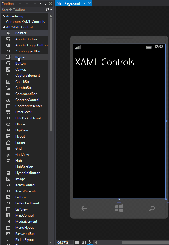
I would recommend keeping three windows open while designing: Toolbox, Document Outline, and Properties. Properties and Document Outline windows were described in my previous article “An introduction to Windows Phone programming”. We will use them frequently, so it saves time keeping them pinned. If you don’t see one of these windows, take a look at the View menu. It will look something like this.
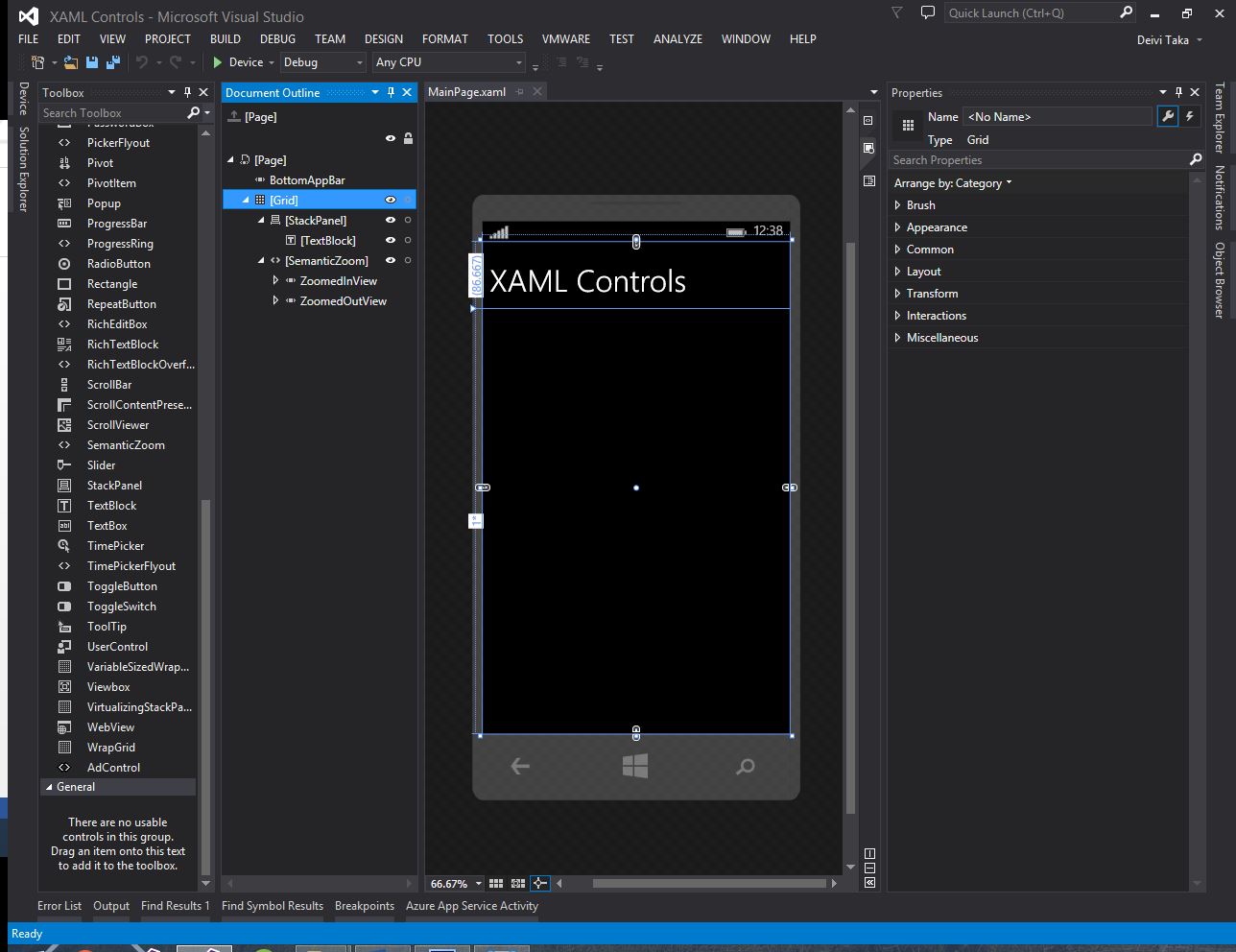
There are two ways to add controls to a page. By writing the code in a XAML view, or by dragging and dropping items in the Design view. You can switch between views by clicking the corresponding button located at the top right corner of the document window.
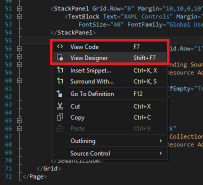
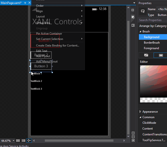
Or by right-clicking inside the view and choosing the correct option.
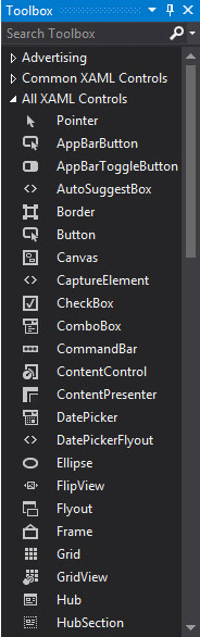
In this article we are going to stick to the second method. Let’s give it a try. Pick any control from the Toolbox and drag it inside the page.
Control Properties
Each time you select a different control in the Properties window you will notice that some of the categories are replaced with others. This is normal, since all controls are unique in their own way. You can set any property a control can have in this window, and it will be added automatically in the XAML code. This makes it a lot easier for us.
The categories I have used the most are Brush, Appearance, Common, Layout, and Text. After you spend some time developing you will find that these five categories are often enough to modify a control the way you want for your app.
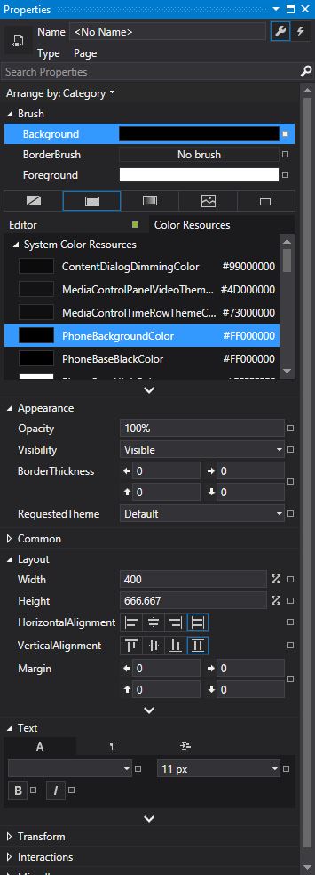
The Brush category modifies the color properties of an element, such as background, border, and foreground color.
Appearance contains properties that change the visibility, opacity, or theme.
Common is more specific to the control type. For example, it may contain a Content property for controls that contain text, such as TextBlock, Button, RadioButton, etc. It may also contain a PlaceHolder property for controls like TextBox, ComboBox, etc. to display some text in case user input is missing.
Layout is a key category, and it’s present for almost all controls. Here you can set the dimensions of the control, its distance from other objects (Margin), its alignment within the parent, etc. When a control is inside a Grid, here you set the grid row and column.
Text category, just like the Content property, is common for controls that have some sort of text in them, whether it’s to display information, or text entered by the user. Properties like FontFamily, FontSize, Bold, and Italic are what you would expect.
The properties window is used to change elements so that they can fit our needs.
Edit Styles / Templates
After changing the right properties we have the controls that we wanted, looking beautiful and placed in the right spots. This is great, but after all that work, what if we wanted another control of the same type looking the same? We would waste a lot of time if everything had to be started from the beginning. Fortunately Visual Studio has the option to save changes you make to a control as a style or a template, depending on the control. I will take Buttons and TextBlocks as an example.
For controls like Buttons, you save properties as a Template. To do this, right-click the button, select Edit Template, and click Edit a Copy… on the submenu that appears on the left.
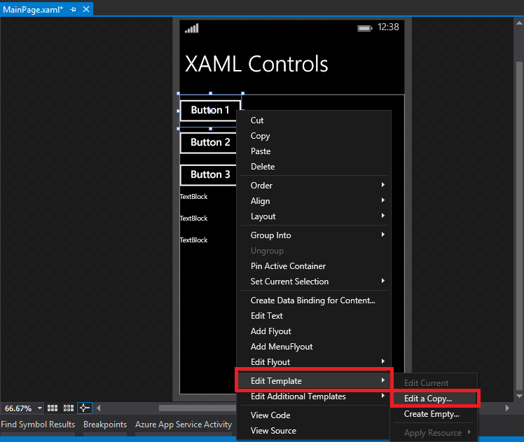
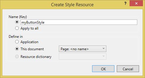
A popup window will appear asking for two things: the name of the template, and where to define it. Both of them are up to you. In case you want to have different templates for the same control type, choose a recognizable name, so it’s easier to recognize later. Then, depending on where you are going to use this template, you can choose to define it in the current page, or the entire application.
Notice that the contents have changed in the Document Outline window. Now we have a list of controls that compose the button. We can change the properties the way we want and they will be added directly to the template.
Now to give the same look to another button, right-click the second button, select Edit Template -> Apply Resource, and click on your custom template.
For controls like TextBlocks you save custom properties as ‘Styles’. The procedure is the same. The difference is that you click Create Empty… instead of Edit a Copy… .
Event Handlers
These are the most important part of controls, making the connection between design and logic. If we add a button to our application, it’s so the user can do something with it. Event Handlers catch the interaction of the user with the application, and depending on whether the user is pressing that button, or holding it, or something else, executes specific code.
If you look at the Properties window, you can spot a lightning icon below at the top right corner. Clicking this icon changes the view of the window to the below.
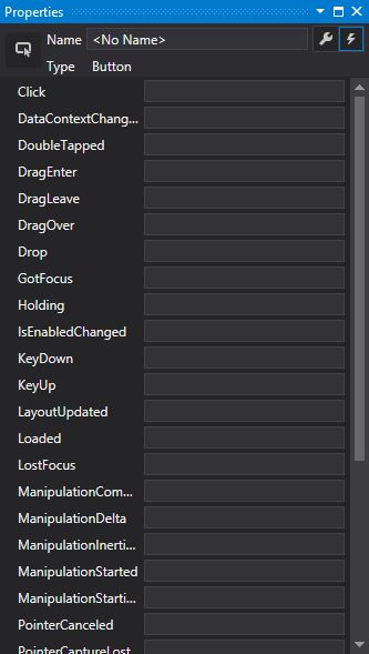
Now you see different types of Event Handlers. If you add an event name (i.e. Button_Click), and hit enter, it will automatically create a method in the class of the page.
private void Button_Click(object sender, RoutedEventArgs e)
{
}
Of course, this method needs code in it to do anything. Another way to add a method is to double click the control, but that only adds the default event listener.
Conclusion
Windows Phone has a unique design style compared to Android and iOS, and you have to adapt to this style at some level. I hope this article helped you gain a basic understanding of the design tools and controls available in Visual Studio for creating your first app.
Thank you for your time. May Code be with you!